
Color is more than just a decorative element. It subtly influences our emotions, perceptions, and atmosphere. A blanket placed beside the sofa in the living room, at the end of the bed in the bedroom, or draped over the body while traveling not only provides warmth but also quietly becomes a mood amplifier. Choosing the right color is like adding a mood filter to your life. In this article, we’ll explore how different blanket colors shape the atmosphere and emotional experience of a space from the perspective of color psychology.
Table of Contents
Color Psychology Basics: How Color Affects Mood and Atmosphere
Color psychology is a powerful tool for interior design. It not only alters the visual warmth of a space but also triggers emotional responses and reduces stress.
For instance, cool shades like blue and green often bring a sense of peace and calm, while hues like red, orange, and yellow tend to evoke energy and warmth.
When it comes to cozy fabrics in the home, this means that a “calm blue” tone can bring serenity to your reading corner, while a “warm orange” hue might make your living room feel inviting and cheerful.
The emotional effect of color is also influenced by factors such as saturation, brightness, contrast, and the environment (flooring, wall color, and lighting). A soft gray textile, for example, may appear elegant in bright light but take on a warmer tone under softer illumination.
Let’s look at how different shades convey distinct emotional meanings and how they can be paired in various settings.
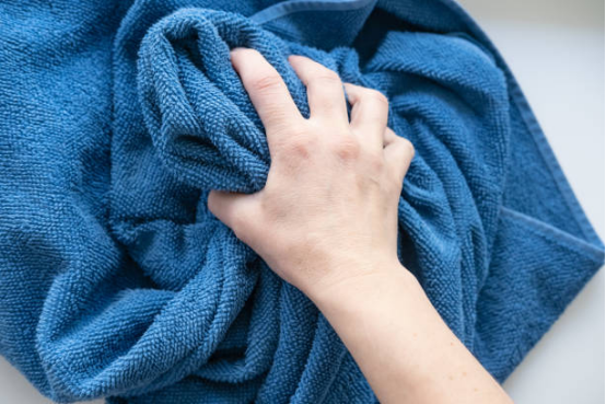
Cool colors: tranquility, rationality, and spatial extension
Blue Fabric
Blue is a universally calming color. It has the ability to lower heart rates, reduce anxiety, and foster relaxation.
- Light blue/sky blue: Creates an airy and open vibe, ideal for minimalist or seaside-inspired interiors. It helps make small spaces appear brighter and more expansive.
- Medium indigo/denim blue: A balanced tone that works well as a neutral. When paired with wooden furniture and white walls, it introduces a sense of calm without being too overpowering.
- Dark blue (navy/twilight blue): Perfect for adding sophistication and tranquility to your space, especially when placed near large windows to evoke a peaceful ambiance.
A subtle blue piece can enhance your bedroom, study, or living room, turning them into emotional meditation corners or quiet zones for rest.
Green Fabric
Green symbolizes nature, renewal, and balance. It brings a sense of freshness and calm to any room.
- Soft mint green/moss green: This muted green adds a gentle, fresh feeling. It fits seamlessly into spaces with a calm, neutral tone.
- Olive green/gray green: This earthy tone creates a stable, grounded atmosphere, perfect for a classic or vintage-style home.
- Dark pine green/Deep green: Best suited for rooms filled with natural light, this shade complements wooden furniture, bringing a “forest retreat” feeling to your home.
Green tones work well as a cooling element in warmer spaces, and they harmonize easily with warm-toned furniture.
Warm colors: enthusiasm, warmth, social atmosphere
Red/Burgundy/Brick Red Fabric
Red, a color full of energy, can stimulate passion, excitement, or intensity.
- Red: Use sparingly. A small touch of red, like a corner throw, can be a vibrant focal point.
- Burgundy/Brick Red: Softer than bright red, these shades blend beautifully with wooden, leather, or brown furnishings. They add warmth without overwhelming the space.
Orange/Camel/Light Orange Fabric
Orange represents warmth, vitality, and intimacy, creating an inviting environment ideal for social spaces.
- Camel/Light Orange: These toned-down oranges bring warmth without being too bold. They are perfect for creating a cozy yet vibrant atmosphere.
- Burnt orange: A great accent in cool-toned rooms like those with gray or white walls, it adds an inviting warmth that draws people in.
Yellow/Soft Yellow Fabric
Yellow is associated with happiness, optimism, and sunlight. A soft yellow can brighten up any space and create a cheerful vibe.
However, it’s important to avoid overly bright yellows that can be tiring to the eyes. Instead, opt for a gentle, creamy yellow to pair with lighter tones like beige or gray for a more calming effect.
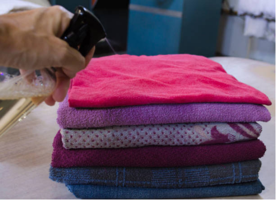
Neutral colors/dark colors/special tones: calm, versatile and textured
Off-white/beige/ivory blanket
Neutral colors are the most inclusive, creating a subtle yet understated atmosphere. Beige or ivory blankets blend discreetly into any style, softening the edges. Designers often use these blankets as a foundational soft furnishing element, not stealing the show but adding a softer, more comfortable feel.
Gray blanket
Gray is seen as a modern, rational, and sophisticated color. Light gray blankets are gentle and clean; medium gray is moderate; and dark gray is steady and silent. Gray blankets pair well with metal, glass, and light wood for a strong sense of elegance.
The risk of gray is that too much of it can appear cold and monotonous. Therefore, it’s recommended to add some colorful elements (throw pillows, plants, paintings) to liven up the atmosphere.
Purple/mint/light pink/peach pink blanket
These softer tones often express romance, tenderness, and creativity. A lavender blanket can create a sense of mystery or elegance; a pale pink or peach blanket can create a “soft island” effect in bedrooms and relaxing corners.
While these colors aren’t as easy to work with as neutrals or teals, they can add a very personal emotional note as mood blankets or seasonal pieces.
How to choose your “emotional” blanket: practical matching strategies
Here are a few strategies for choosing the right blanket color for your space and mood:
Start with the main color and then choose the blanket color
First, determine the room’s primary colors (walls, main furniture, flooring), then choose blanket colors based on contrast/contrast. For example, if the room’s primary colors are off-white and light wood, a blanket color like dark green, burnt orange, or light gray might be appropriate.
Use the 60–30–10 rule to control color proportions
In the overall soft furnishings layout, blankets often appear as the “10% accent color.” 60% is the base color (such as off-white or wood), 30% is the secondary color (such as fabric sofas and curtains), and 10% is reserved for splashes of blanket or small decorative accents.
Use gradients/shades/neutral tones to transition
If you feel a solid-color blanket is too stark, opt for one with a gradient, color-blocking, or subtle patterns to create a more natural transition. For example, a light gray fading to gray-blue or a beige to light brown are all easier to blend into the space than a single, strong color.
Change blanket color according to season/mood
For spring and summer, choose cool, clear blue and green, while for autumn and winter, go for warm or dark tones. Changing a color is like giving a room a mood filter—this is a subtle but effective way to “update soft furnishings.”
Considering the impact of light and material on color
Colors can vary significantly under different light sources (cold light, warm light, natural light). When purchasing a blanket, it’s recommended to compare the sample blanket under both natural light and outdoor lighting. Also consider how the material (suede, Tencel, cotton, or blended) reflects light: Fluffy materials tend to appear warmer under light and shadow.
Summary and practical suggestions
The color of a blanket isn’t just about decoration; it’s about expressing your emotions. Choose the right color, and your blanket can become a haven of peace, a haven of warmth, or a mood-enhancing addition to your social living room.
Here are a few key points:
- Cool colors (blue/green): tranquil and relaxing, an ideal “color blanket for the soul”;
- Warm tones (red/orange/yellow): Vibrant and warm, used as embellishments or in controlled amounts;
- Neutral colors/gray/beige: versatile, safe, and softens the space;
- Soft/romantic colors (pink/purple): express your individual style, but in moderation.
When choosing a blanket, consider not only its material and functionality but also its color identity. Let the blanket become an “emotional carrier” in your living context, silently influencing the spatial atmosphere and psychological experience.
I wish you could find the “right color” blanket to synchronize the temperature and mood in your home.